INDIANA – The iconic U.S. retail giant Walmart has unveiled a refreshed logo, marking its first significant redesign in 17 years. The update comes after the retailer’s previous logo overhaul 2008, which notably removed the hyphen between “Wal” and “Mart”—a key feature that had been part of the brand since its founding in 1962.

Walmart’s Senior Vice President and Chief Marketing Officer, William White, explained that the new logo is more than just a cosmetic change. “This update, rooted in the legacy of our founder, Sam Walton, demonstrates our evolving capabilities and longstanding commitment to serve our customers of today and tomorrow,” White stated in an official announcement. The redesign, he emphasized, is not a full “rebrand,” but rather a “refresh” meant to reflect Walmart’s current identity and its venture into e-commerce and the digital marketplace.

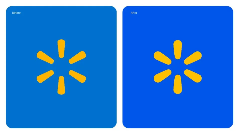
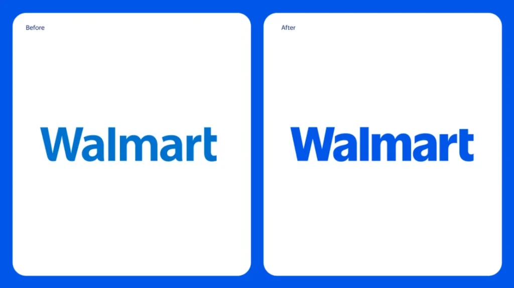
The new logo showcases several key updates. The word “Walmart” now appears in thicker lettering, and the iconic yellow spark, reminiscent of a sun, features broader stems and a brighter hue. The background has shifted to a deeper shade of blue, giving the logo a more modern and polished look. These changes aim to signal Walmart’s transformation into an inspirational, digital-first retailer that offers a broad range of products, brands, and services to meet the needs of modern customers.


This month, Walmart’s updated logo will begin appearing on the retailer’s online platforms, physical stores, and its new home office in Bentonville, Arkansas. The redesign aligns with the company’s continued evolution and underscores its dedication to staying relevant in an increasingly digital world.
As Walmart continues to expand its digital and e-commerce capabilities, the refreshed logo symbolizes the retailer’s commitment to adapting to the needs of its customers, while honoring the principles laid down by Sam Walton nearly six decades ago.


.png)


